Blog
Customer EngagementRefer-a-Friend Examples
Referral Page Examples: 16 Proven Designs for More Referrals
Courtenay Roche

Products
Enterprise platform
Platform features
Acquisition programs
Retention programs
Learn
Resources
Developers
Documentation
SDKs & GitHub
Blog
Courtenay Roche
A well-designed referral page can turn a passive customer into an active advocate—and a curious visitor into a new customer. The difference between a referral program that drives measurable growth and one that sits idle often comes down to the page itself. This guide breaks down 16 referral page examples from leading brands, covers the key elements that make them convert, and walks through how to build and optimize your own.
A referral page is a dedicated web page where customers learn about a referral program, grab their unique referral link, and share it with friends. Think of it as the home base for your referral program—the place where advocates go to participate and referred friends land to claim their offer. The typical referral page includes:
Most referral programs actually involve two pages working together. One speaks to existing customers, while the other welcomes the friends they refer.
This is the page your current customers see when they access the referral program. It usually lives inside their account dashboard or arrives via email after a purchase. The whole point here is to motivate sharing—while 83% of customers are willing to refer, only 29% actually do. Optimized advocate experiences help close that gap: Showing the reward, making it easy to grab a link, and providing one-click sharing options is critical.
When someone clicks a referral link, they land on this page. It's their first impression of your brand, so it welcomes them, explains the offer, and encourages them to convert. The best friend landing pages acknowledge the referral relationship—something like "Your friend thought you'd love this."
Across industries, the referral pages that perform well share a handful of common elements. Here's what to include.
The headline does the heavy lifting. It communicates the benefit of participating in just a few words. "Give $20, Get $20" works because it's immediate and specific. Vague headlines like "Share With Friends" don't give visitors a reason to act.
Rewards belong above the fold where visitors see them without scrolling. Both the advocate reward and the friend reward deserve prominent placement. Bold text or callout boxes help the incentive stand out from surrounding content.
A well-chosen hero image reinforces the brand and creates emotional connection. Lifestyle photography showing happy customers or high-quality product shots tend to perform well. The visual sets the tone before visitors read a single word.
A 3-step breakdown removes confusion about the referral process:
Icons or numbered graphics make this section easy to scan.
The CTA button drives the action you want. "Share Now," "Get Your Link," or "Refer a Friend" all work because they're specific and action-oriented. Placement above the fold matters—visitors shouldn't have to hunt for the button.
Referral pages that match your brand's look and voice feel like a natural part of the customer experience. Consistency signals legitimacy and builds trust.
Transparency helps visitors feel confident participating. Clear eligibility rules, reward details, and answers to common questions can live in a collapsible section or linked page to keep the main content clean.
The following examples span retail, fintech, SaaS, and subscription services. They're organized by type—advocate pages first, then friend landing pages—so you can find relevant inspiration based on what you're building.
These pages show how brands motivate existing customers to share.
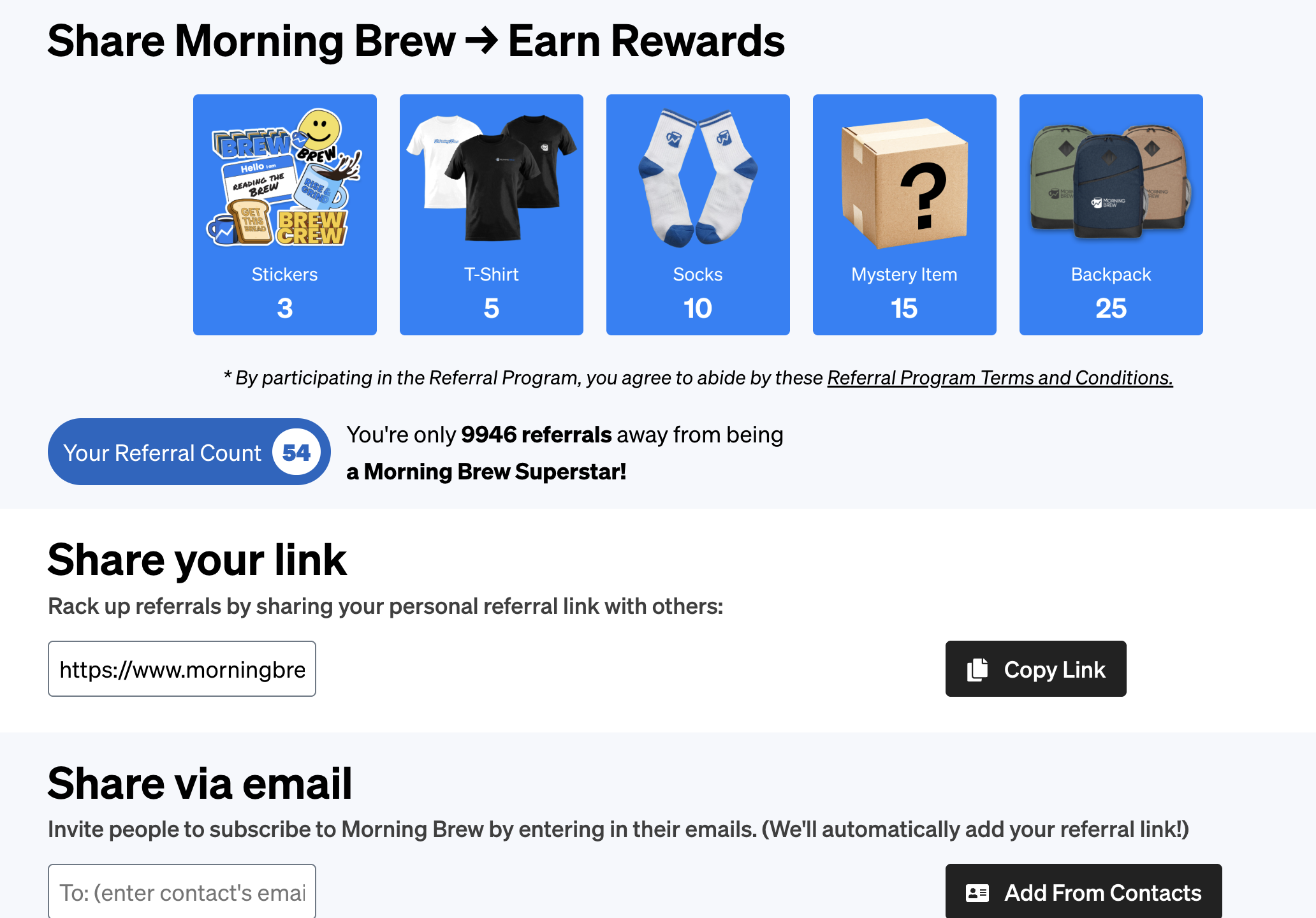 Morning Brew uses a gamified milestone system. Advocates earn increasingly valuable rewards—from stickers to premium merchandise—as they hit referral milestones. Progress tracking keeps members engaged over time.
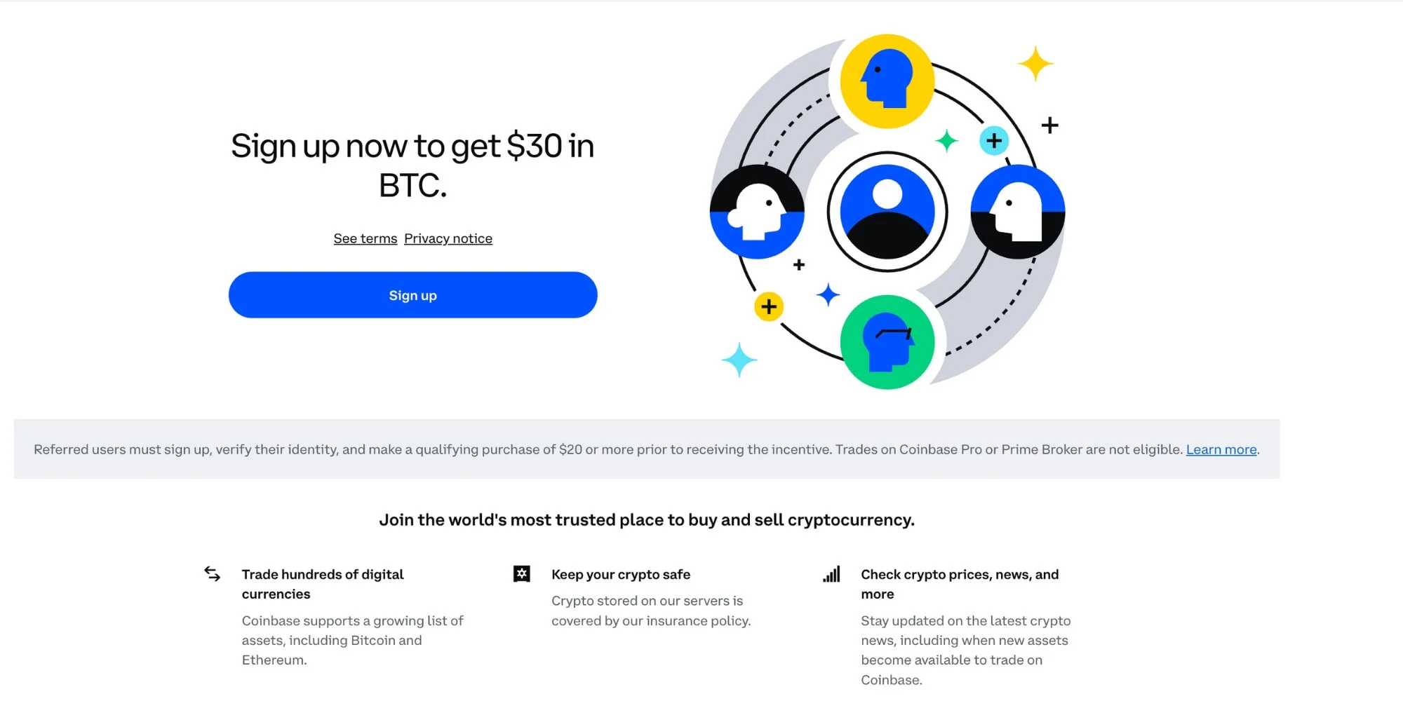 Coinbase targets its audience with a reward users are likely to respond to: cryptocurrency. Trust signals are also prominent, which matters for fintech referral programs where credibility drives participation.
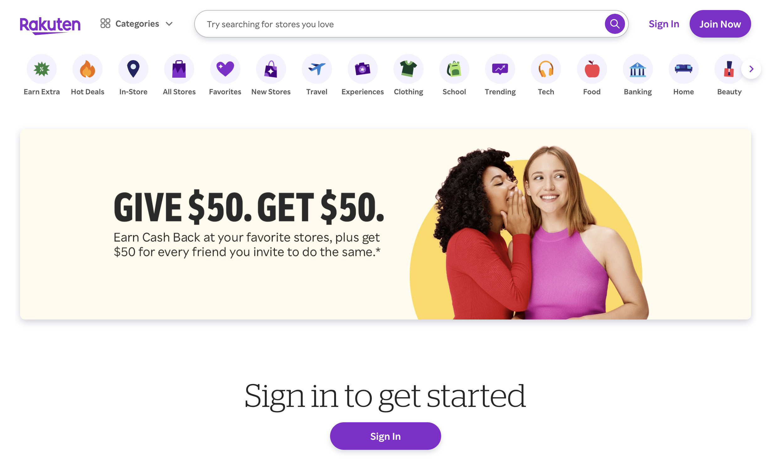
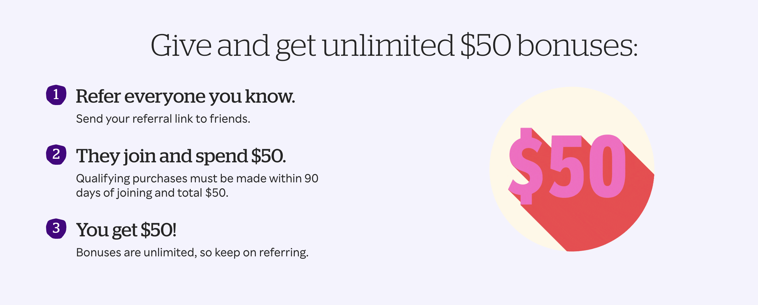 Rakuten's page emphasizes a dual-sided reward structure. Both the advocate and friend benefit, and the prominent CTA makes the next step obvious.
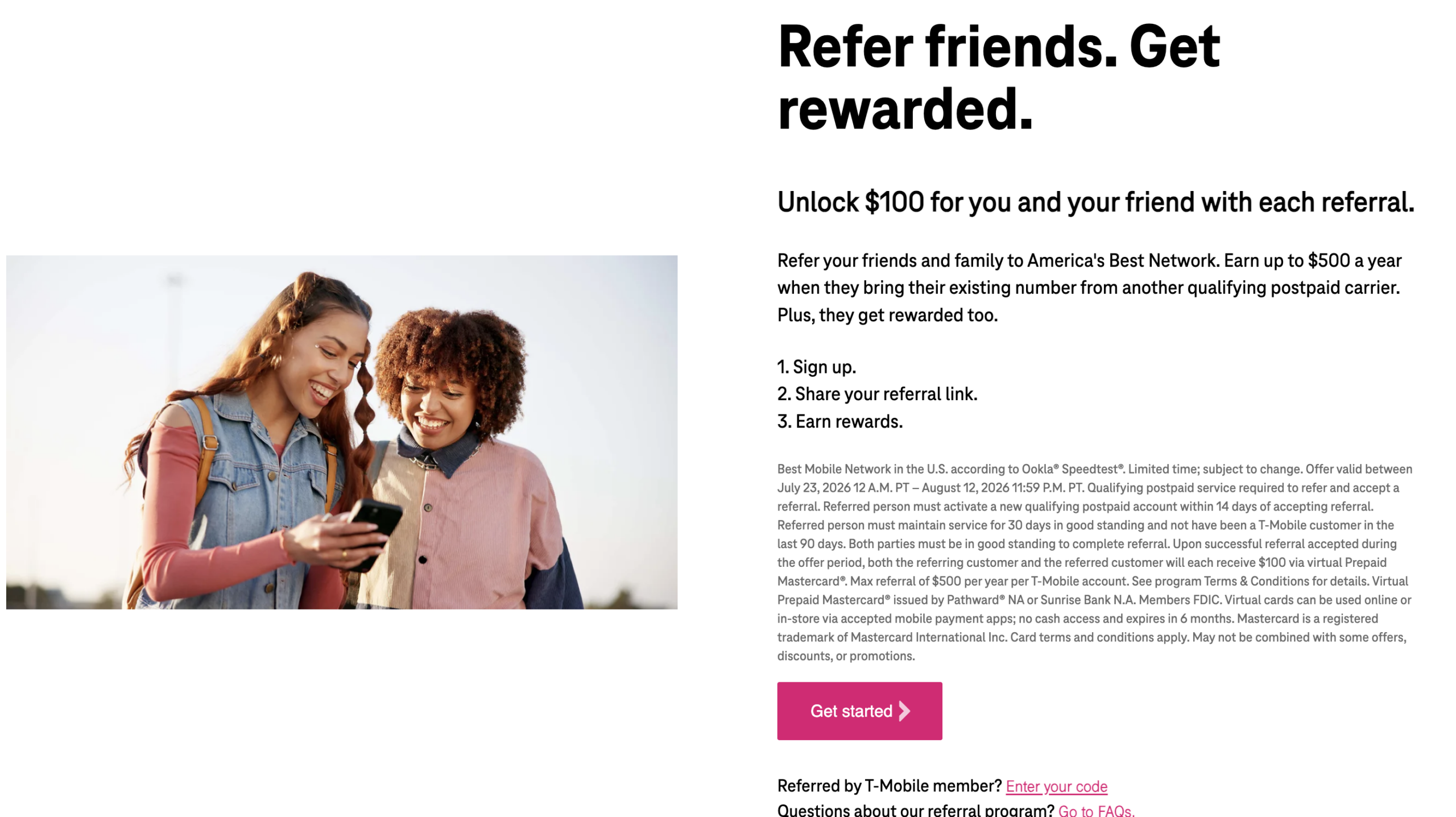 T-Mobile offers account credits as the reward. The mobile-first design reflects how their customers actually interact with the brand—primarily on phones.
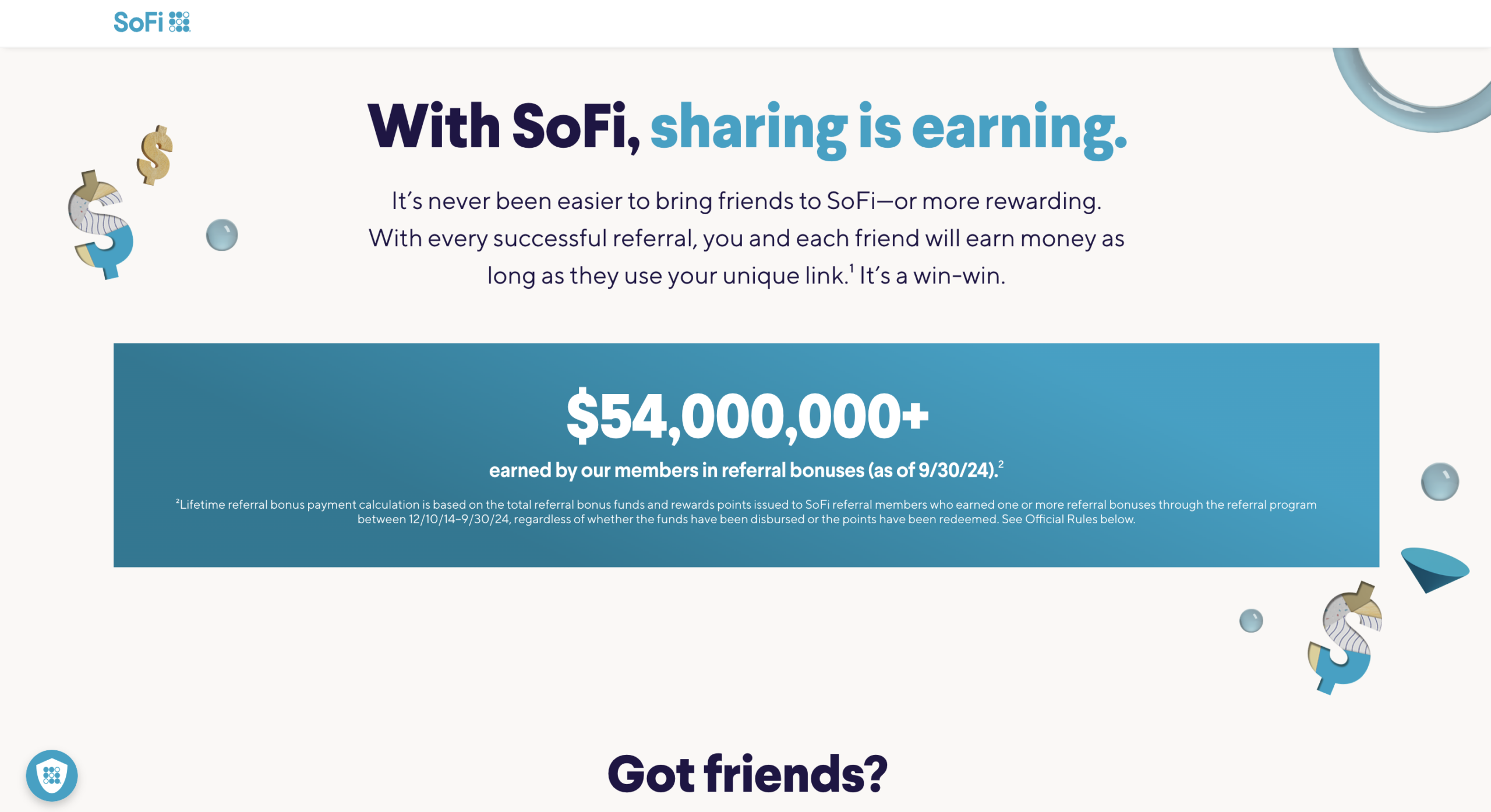
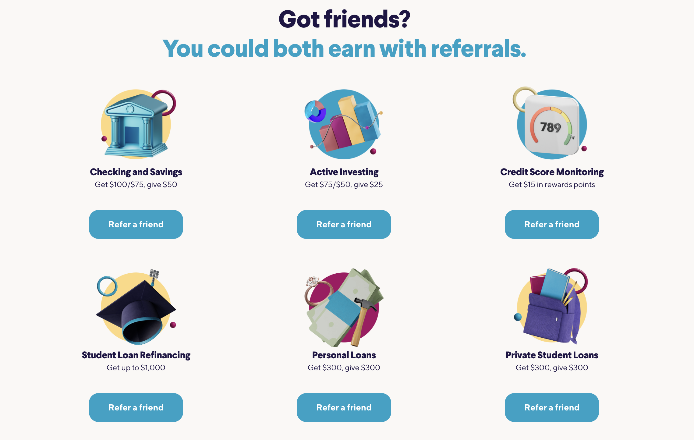 SoFi combines compelling cash bonuses with a vibrant and informative design. Displaying the multitude of products SoFi offers is both useful for advocates who want to understand the rewards program and a way to introduce them to potential new financial products.
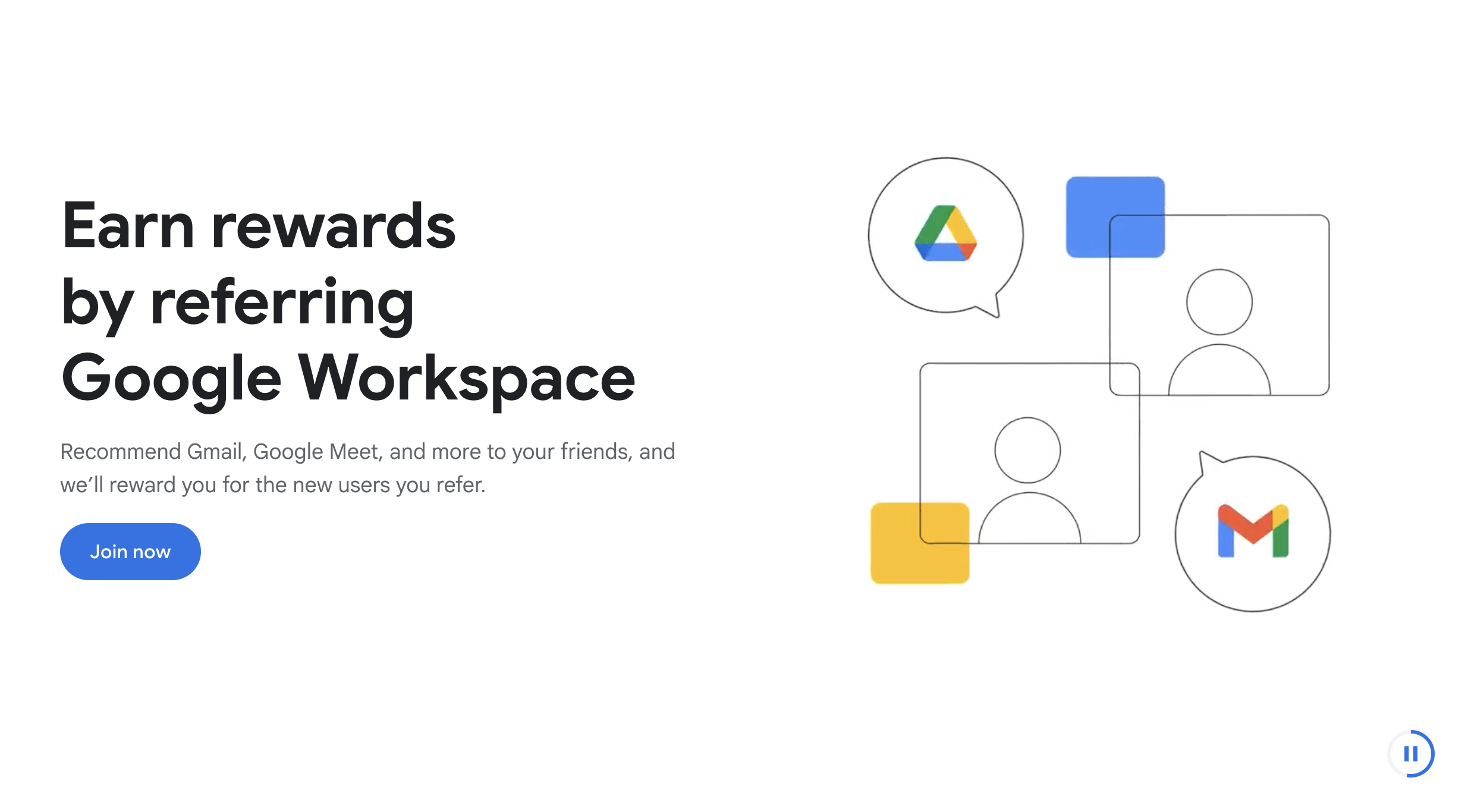
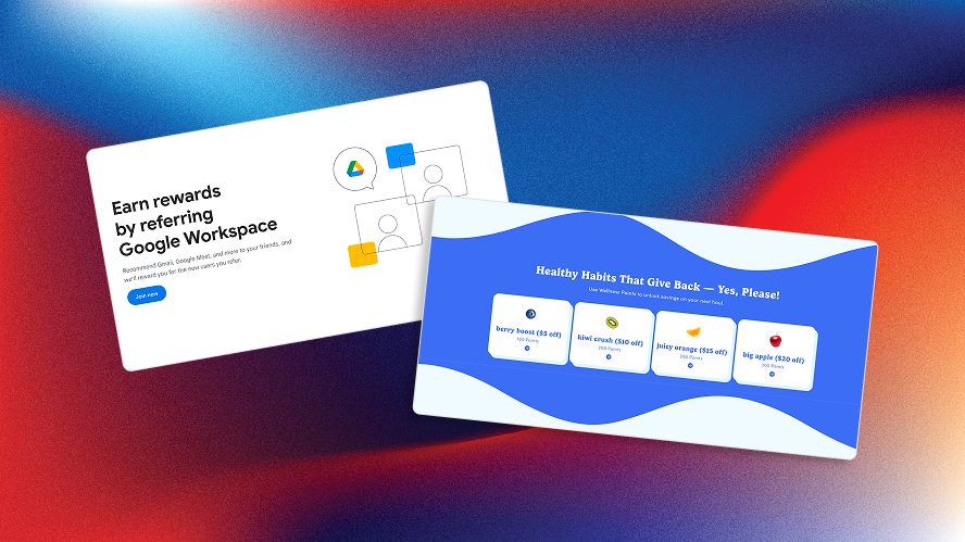
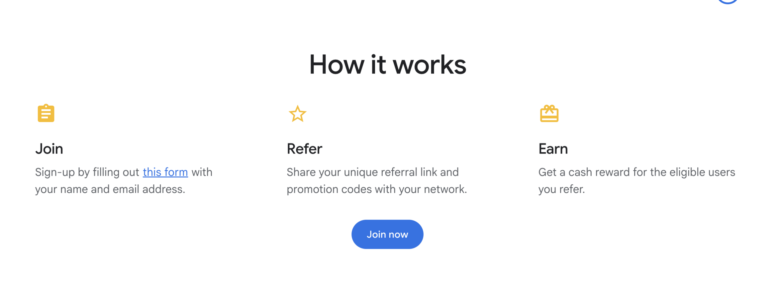 Google Workspace uses account credits for enterprise referrals. The minimal design stays consistent with Google's broader brand aesthetic and makes it easy for advocates to understand the referral mechanics.
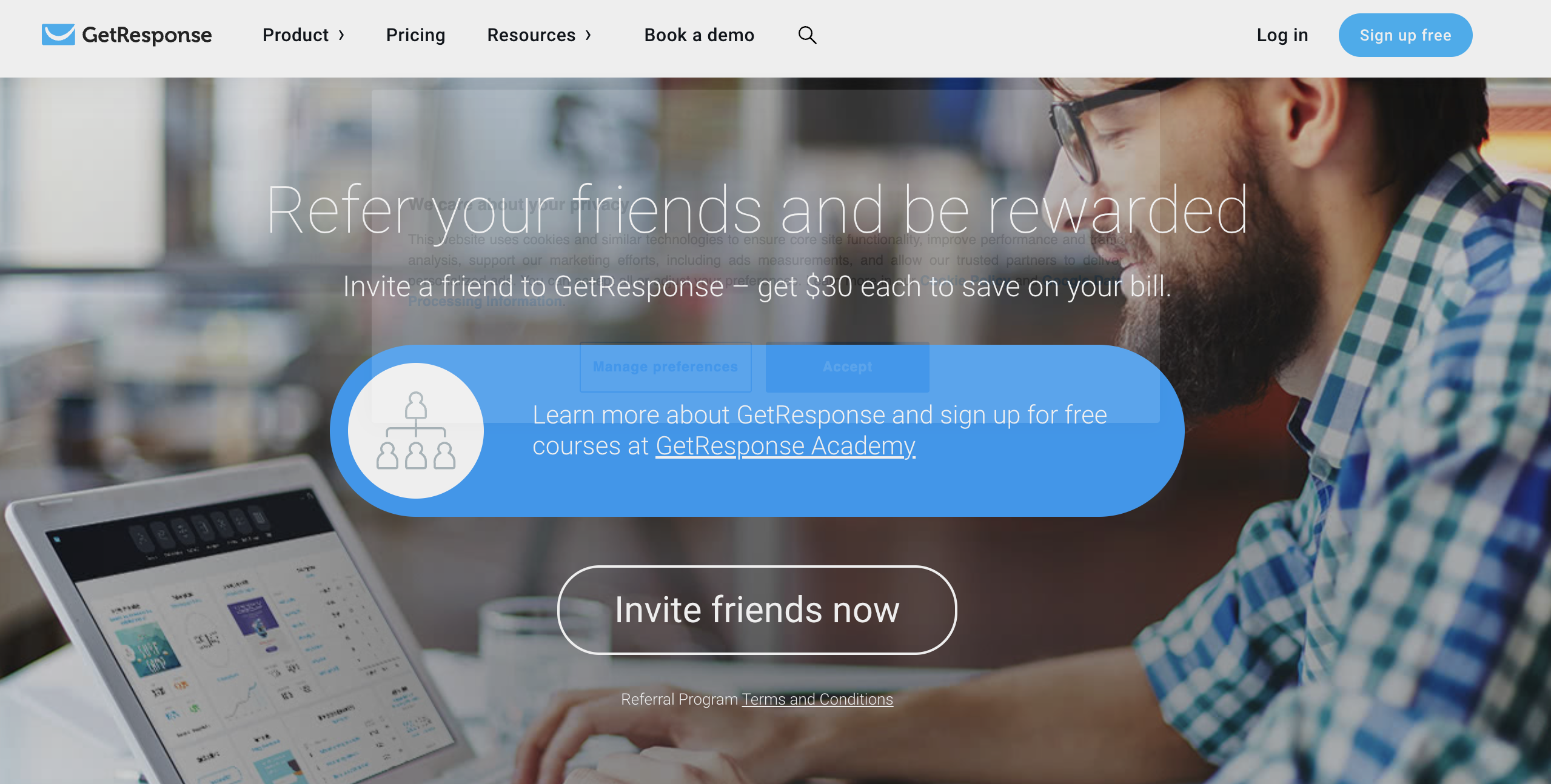
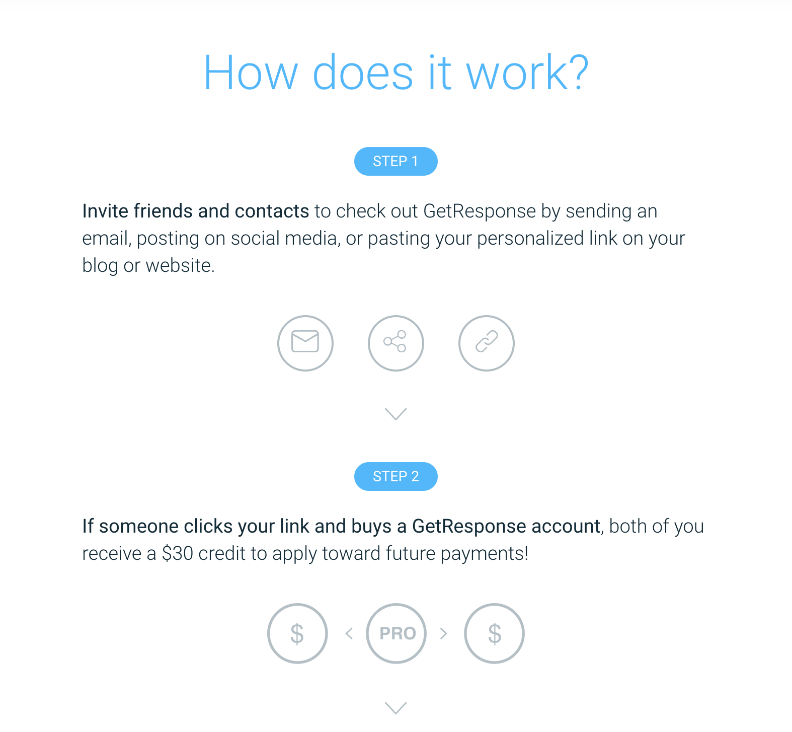 GetResponse highlights a recurring commission model. Advocates earn ongoing rewards, which appeals to those looking for long-term earning potential.
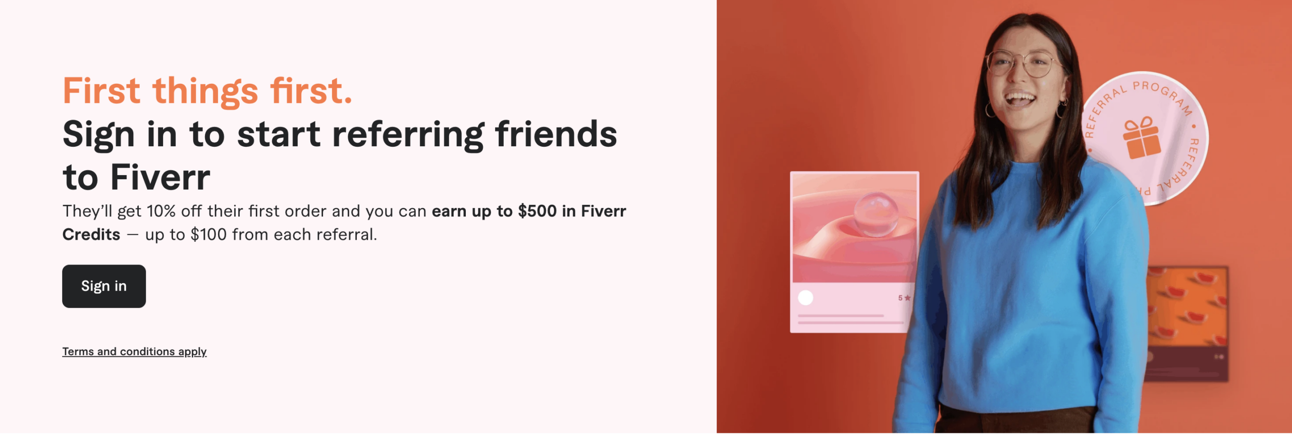
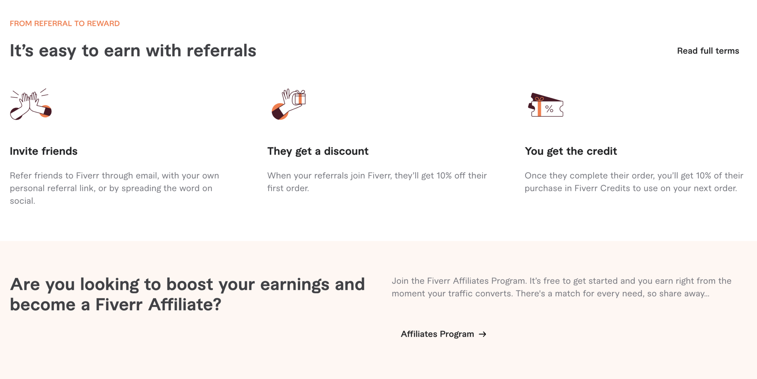 Fiverr's marketplace approach uses credit-based rewards that encourage continued platform usage. A simple visual walk-through shows advocates how to navigate the two-sided marketplace mechanics. The landing page also differentiates the referral program from the affiliate program, providing a brief description and a CTA for interested affiliates at the bottom of the page.
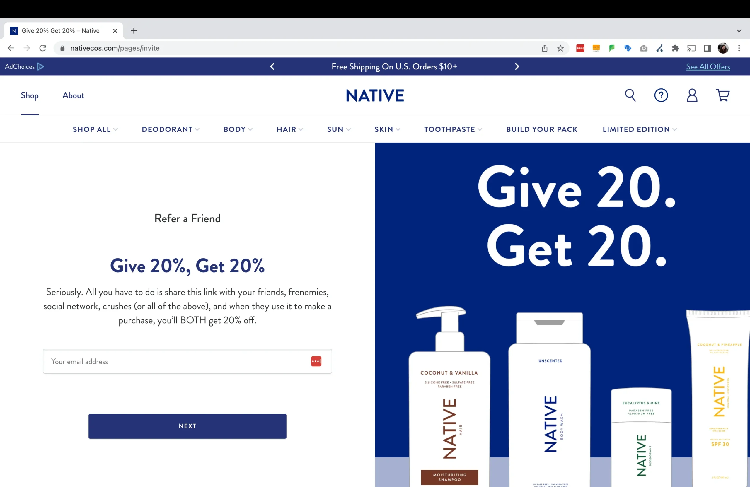 Native maintains a clean aesthetic with a straightforward discount, plus on-brand copy that is authentic and engaging. Product imagery and a simple referral process keep the experience frictionless.
These pages show how brands welcome and convert referred visitors who may be encountering the brand for the first time.
 Gusto takes friends to a page with a pop-up describing the referral benefits they can expect—and the exact format in which it will arrive. The professional design appeals to business owners and HR professionals.
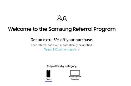 Samsung's exclusive friend discount is automatically applied for a seamless shopping experience. A simple CTA with two choices directs friends towards the products they are most interested in so they can begin browsing right away.
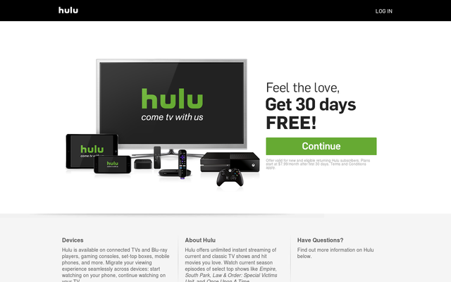 Hulu offers free trials or discounts to referred friends. The signup flow stays simple, and entertainment-focused imagery keeps visitors engaged.
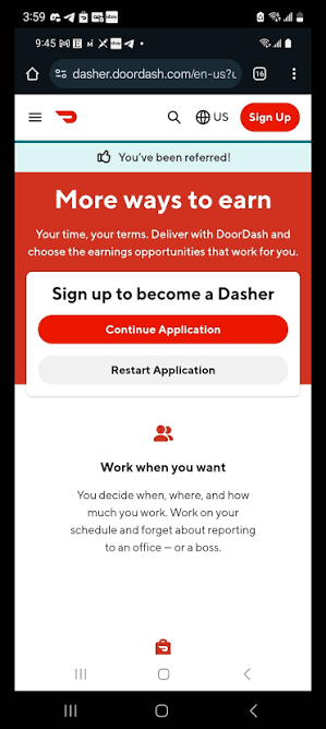 DoorDash leads with a clear discount and an easy app download CTA. The mobile-optimized design recognizes that most referred friends arrive on their phones.
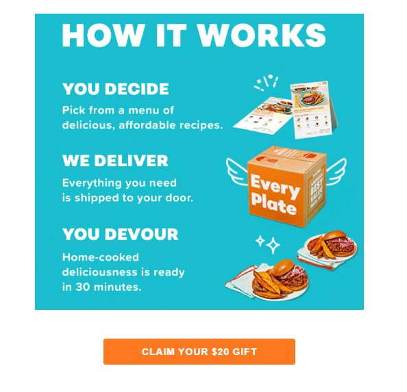 EveryPlate's meal kit page features a strong first-box discount alongside appetizing food photography. Simple plan selection reduces friction.
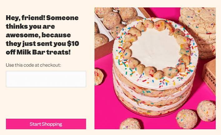 Milk Bar brings playful design and personality to their friend landing page. The copy and visuals reflect the brand's dessert-focused identity.
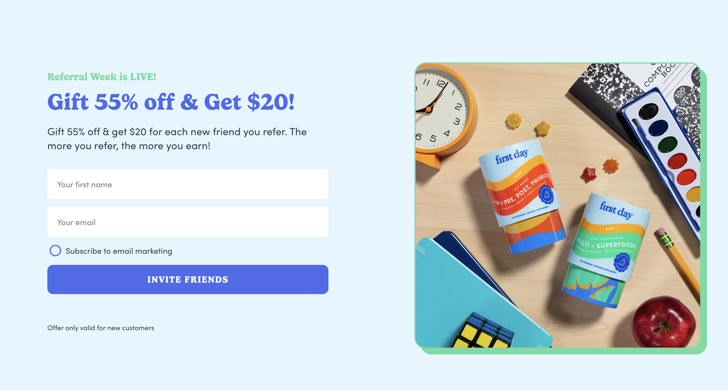
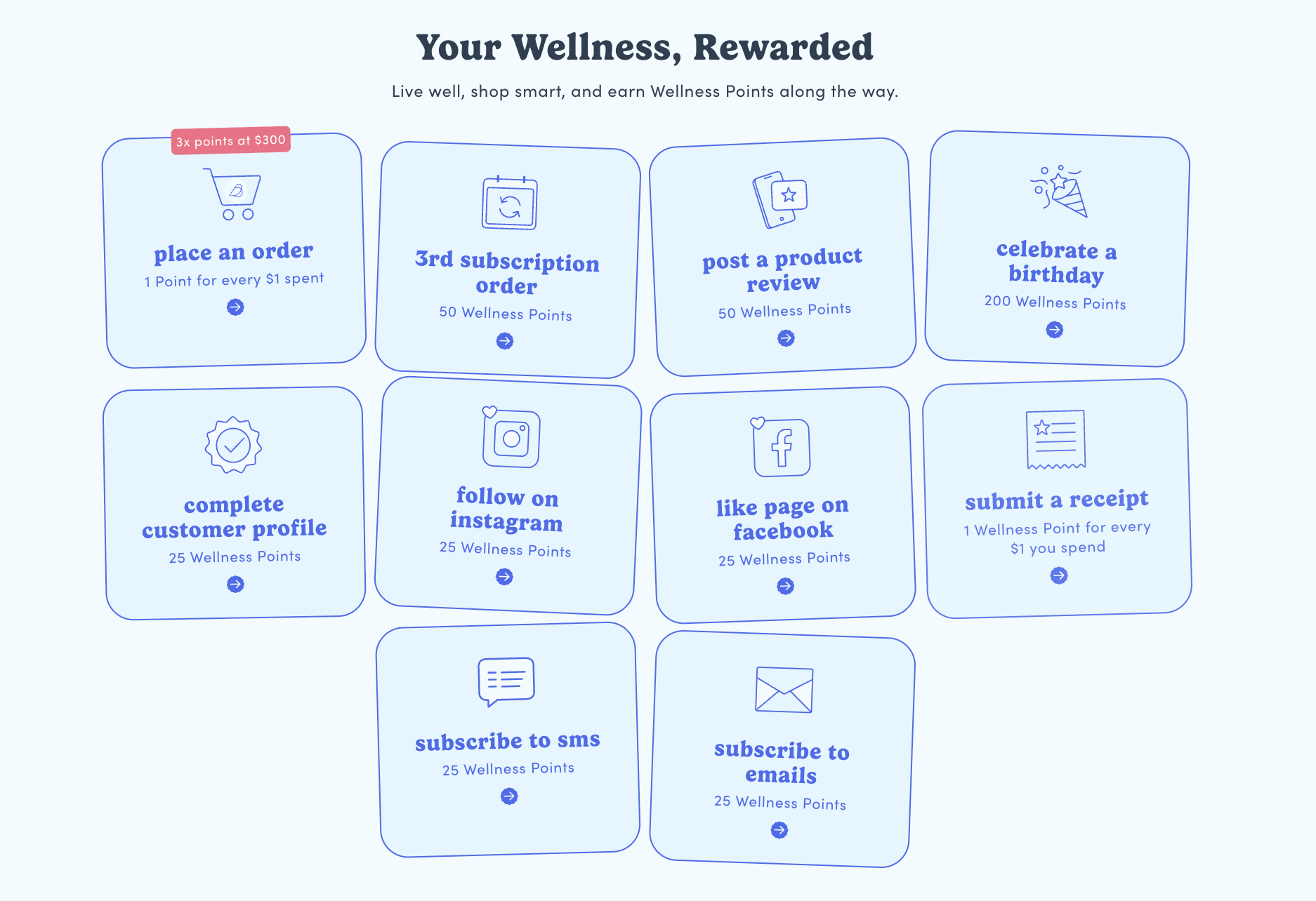 First Day's subscription vitamin page uses a family-friendly design that resonates with their parent audience. Product benefits appear alongside the referral offer.
Building a referral page involves more than design. Here's a framework for launching a program that drives results.
Start with clear objectives. Are you focused on customer acquisition, retention, or both? The incentive structure—one-sided versus two-sided rewards—follows from your goals. Common reward types include:
Referral software handles tracking, reward fulfillment, and fraud prevention. Enterprise platforms offer deeper integrations and analytics than basic tools, which becomes important as programs scale.
Drag-and-drop builders and customizable templates speed up launch. Both advocate and friend pages benefit from cohesive design that feels native to your customer experience.
Referral pages drive participation when they're visible. Key promotion touchpoints include post-purchase emails, account dashboards, website banners, mobile app prompts, and social media.
Tracking metrics like shares, conversions, and program ROI informs ongoing optimization. The best programs evolve based on data.
Launch is just the starting point. Ongoing optimization helps programs improve over time.
Most referrals happen on mobile devices—Forrester found 65% through messaging apps alone. Responsive design, thumb-friendly CTAs, and fast load times ensure the mobile referral experience works where customers actually share.
Different customer segments respond to different messaging and rewards. Advanced platforms enable segmentation and personalization at scale.
A/B testing reveals what resonates. Headlines, reward amounts, imagery, and CTA text all present opportunities for systematic experimentation.
Social proof like testimonials, review counts, and trust badges increases conversions—especially on friend landing pages where visitors may be unfamiliar with the brand.
Fraud prevention protects program integrity and ROI. Enterprise referral platforms include built-in controls that catch suspicious activity before rewards are issued.
| Dedicated referral software offers advantages over building in-house, particularly for teams that want to launch quickly and iterate based on performance. Capability | In-House Build | Referral Platform |
|---|---|---|
| Page templates | Custom development required | Pre-built, customizable |
| Reward fulfillment | Manual or custom integration | Automated |
| Fraud prevention | Built from scratch | Built-in controls |
| Analytics | Custom reporting setup | Real-time dashboards |
| A/B testing | Developer dependent | Native functionality |
| Integrations | Each built individually | Pre-built connectors |
| Platforms like Extole provide enterprise-grade infrastructure so teams can focus on program strategy rather than technical plumbing. |
The referral page examples above share common threads: clear value propositions, on-brand design, simple sharing mechanics, and visible rewards. Extole's enterprise referral platform brings these elements together with customizable templates, drag-and-drop builders, advanced segmentation, fraud protection, and robust analytics. Request a Demo to see how Extole helps leading brands build high-converting referral pages at scale.
A referral page is a specific type of landing page designed to promote a referral program and facilitate sharing. General landing pages serve broader marketing purposes like lead capture or product promotion.
Referral pages work best when they're concise. Key information belongs above the fold, with supporting details—terms, FAQs, additional context—available below for visitors who want more.
Conversion rates vary by industry, offer, and audience. Tracking your share rate, click-through rate, and referred conversion rate helps measure performance against your own program goals.
High-visibility touchpoints drive the most participation: post-purchase confirmation emails, account dashboards, order confirmation pages, mobile app menus, and website navigation.
Costs range from minimal when using referral software with built-in page builders to significant when custom-developing pages in-house. Enterprise platforms often offer the best balance of customization and speed to launch.
Loyalty management software automates the design, execution, and analysis of customer reward programs—tracking purchases, points, and VIP tiers across every channel where your…

Your best customers already talk about your brand. A referral program gives them a reason to do it more often—and rewards them when those conversations turn into sales.

Credit unions face a familiar tension: compete with institutions that outspend you ten-to-one on advertising, or find smarter ways to grow. The good news is that credit unions…